Art Style and Limitation

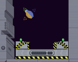


The art style for the game was generally decided from the start. I wanted to design and draw the art myself and I'm not very familiar with 3D modeling so the art had to be done in 2D.
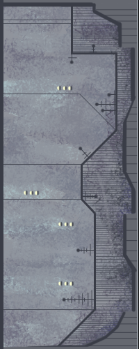
I tried some different approaches based on what I knew the gameplay would be - flying around a ship in zero G. I tried to make it a strict top-down perspective but I did not like how it turned out looking. (An example of the wall I tried to make with this.)
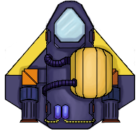
I switched to an isometric perspective in order to better show depth and liked this a lot better but it would come back to limit the game. The main issue with using 2D sprites to show isometric perspective, or any really, is that you can't rotate anything. To rotate an object the sprite would have to be completely redrawn. I have not even close enough time to redraw everything from 12+ perspectives so the outcome was that the camera angle became fixed. This made navigating the ship initially harder until the user got used to the controls but there was no real alternative except to switch to a top down perspective and I decided against it. The original design for the ship looked like this.
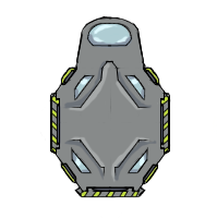
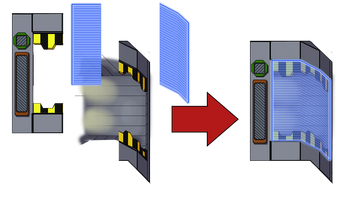
Controlling the ship was confusing though because the camera did not rotate and it was easy to mix up left and right when the ship was not facing upwards. I thought the issue might be tied to how symmetrical the ship was with even the front and back being very slightly different. My first attempt at a solution was to make the right and left sides visually distinct which I did by making them distinct colors as well as adding some marking. (Also shown the original design for the exit gate which was also drawn from a top down perspective.)

This seemed to help and so the next design for the ship made sure it was asymmetric with each of the four sides of the ship being visually distinct. This helped orient the ship while it was rotating in space.

Of course the ship itself has to be able to rotate as well as anything free floating that it interacts with. To make this work I compromised by having any free floating object, like the ship, be drawn from a top-down perspective and so could be rotated freely.
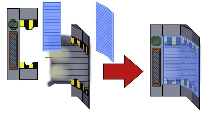
Other assets were drawn in true isometric perspective and due to the symmetrical nature it was easy to rotate by 90 degrees by flipping after rotation, although some things like cast shadow and shading had to be redone. Still there were issues with some objects that had to interact with the ship, such as the new exit gates. Up to three different "heights" could be necessary per object, where the height is the order in the layer that the sprite is rendered in. To give the illusion of depth some areas had to be behind the ship while others were in front and this order could even change based on what was happening. For instance the hatch doors lower part had to be below the ship however as the doors were closing on top of the ship they needed to become higher than it. This was also true for interactable barriers that needed to be above and below the ship depending on where the ship was.


Drawing the assets was in many ways a serious challenge but it was one I enjoyed tackling and I look forward to making more 2D games using the lessons I have learned from this one.
Get Reaction
Reaction
| Status | In development |
| Author | moarvespenegas |
| Genre | Platformer, Action |
| Tags | 2D, Sci-fi, Space, Unity, Zero Gravity |
More posts
- UI and Movement UpdateDec 20, 2020
- Reaction Devlog(In development)Dec 09, 2020
Leave a comment
Log in with itch.io to leave a comment.